the psychology of colors in branding and packaging
Color is one of the most powerful tools in branding and packaging design. It influences customer perceptions, evokes emotions, and plays a crucial role in purchasing decisions. Brands that understand the psychology of colors can create more impactful visuals and build stronger connections with their target audience.
Why Color Matters in Branding
Color is often the first thing consumers notice about a brand. It sets the tone for a company’s identity and can instantly communicate a message without words. Research shows that up to 90% of snap judgments about products are based on color alone. When used strategically, colors can enhance brand recognition, create emotional connections, and even influence buying behavior.
Understanding Color Psychology in Branding
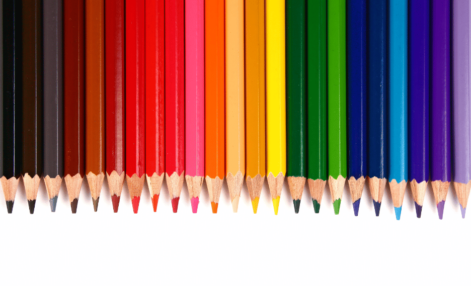
Each color has unique psychological effects, making it essential to choose the right hues that align with your brand’s values and messaging. Here’s what different colors represent:
1. Red – Passion, Energy, and Urgency
Red is bold and attention-grabbing. It evokes strong emotions, increases appetite, and creates a sense of urgency—making it popular in fast food (McDonald’s, KFC) and retail sales (Coca-Cola, Target). If your brand aims to excite or stimulate action, red is a powerful choice.
2. Blue – Trust, Dependability, and Professionalism
Blue is associated with trust, security, and stability. It’s commonly used by banks (Chase, PayPal) and tech companies (Facebook, IBM) to establish credibility and reliability. If you want to build trust and professionalism, blue is a great option.
3. Yellow – Optimism, Warmth, and Positivity
Yellow radiates happiness and friendliness. It’s often used by brands targeting a youthful audience (McDonald’s, Snapchat) or those wanting to evoke cheerfulness. However, too much yellow can be overwhelming, so it should be used wisely.
4. Green – Growth, Health, and Sustainability
Green represents nature, freshness, and health. It’s widely used in organic and eco-friendly brands (Whole Foods, Animal Planet) and financial services (Fidelity, TD Bank) to symbolize prosperity and well-being.
5. Orange – Creativity, Fun, and Enthusiasm
Orange is energetic and playful. It conveys friendliness and creativity, making it popular in entertainment (Nickelodeon) and technology (Firefox, SoundCloud). If your brand is youthful and dynamic, orange can be a great fit.
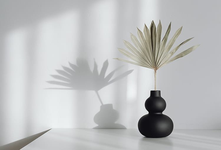
6. Black – Luxury, Sophistication, and Power
Black is elegant, timeless, and high-end. It’s often used by luxury brands (Chanel, Prada) and tech companies (Apple, Sony) to convey exclusivity and sophistication. When used effectively, black adds a sense of prestige and mystery.
7. White – Simplicity, Purity, and Minimalism
White is associated with cleanliness and simplicity. It’s commonly seen in healthcare (Johnson & Johnson) and modern tech brands (Apple, Tesla) to communicate clarity and innovation. It works well for minimalist designs and high-end branding.
the psychology of colors in branding and packaging
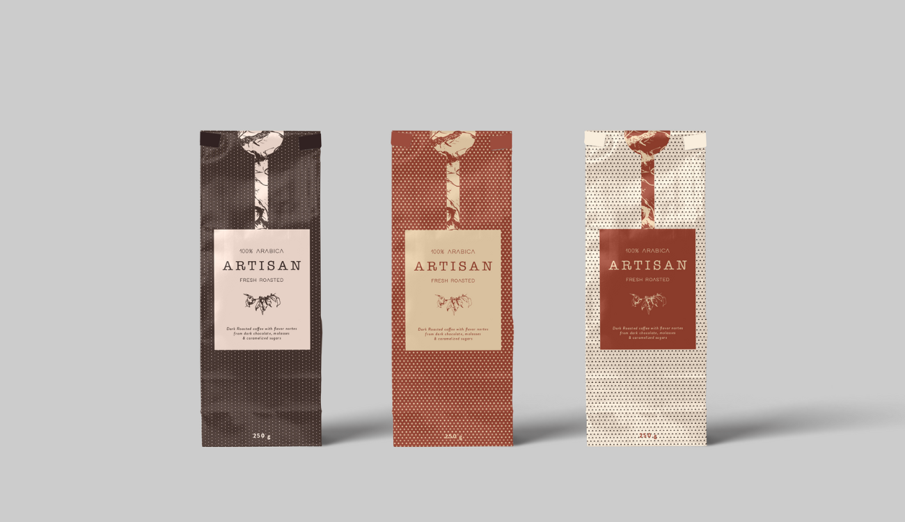
Color Psychology in Packaging Design
Packaging is often the first interaction a consumer has with a product, and color plays a huge role in influencing their buying decisions. Here’s how different colors impact packaging:
✅ Red & Orange: Create excitement and grab attention quickly, making them ideal for impulse-buy products.
✅ Blue & Green: Promote trust and wellness, making them great for food, health, and financial brands.
✅ Black & Gold: Add a premium feel, often used in luxury packaging to evoke elegance.
✅ Bright Colors: Convey fun and energy, often used in products aimed at younger audiences.
At 3A Media Group, we are passionate about bringing brands to life through innovative design, cutting-edge digital solutions, and impactful experiences
At 3A Media Group, we are passionate about bringing brands to life through innovative design, cutting-edge digital solutions, and impactful experiences


Leave a Reply